

Professional design
Responsive layouts that adapt cleanly to desktop, tablet and mobile while keeping your content clear and easy to navigate.

Fast, responsive websites built on clean, intelligent code to the latest standards.

Ultra-fast load time has nothing to do with hardware!
Our underlying code is clean and lean—Built to load fast on any device
Discover the difference it makes!A website has to look good, but it also has to be fast, accessible, easy to use and simple for search engines to understand. WDNet brings those requirements together, ensuring that your website passes all Core Web Vitals with flying colours!
Responsive layouts that adapt cleanly to desktop, tablet and mobile while keeping your content clear and easy to navigate.
Careful page structure, meaningful content and sensible keyword research to help the right people discover your business.
Standards-based HTML, CSS and JavaScript kept as lean as the project allows, with performance considered from the start.
A consistent visual foundation for your colours, typography, imagery and message, shaped around how you want customers to see you.
Creative solutions that serve a purpose—whether that is generating enquiries, explaining a service or making information easier to find.
No anonymous ticket queue. You deal directly with me, and when a project needs specialist help I bring in trusted people I know.
I design websites around the business behind them—not around a ready-made template.
We begin with a proper conversation about your services, customers, goals and competitors. The aim is to understand what the site must achieve before deciding what it should look like.

We establish who the site is for, what makes your business different and what action you want visitors to take.
I research the market, organise the content and prepare a visual direction for you to review before development.
The approved design becomes a responsive website, tested across screen sizes and refined as the content comes together.
Once you are happy with the agreed result, the site goes live and I remain available for changes, advice and future development.
Search visibility begins with useful content and a site that people can use comfortably. Technical quality supports that work, but no single score guarantees a ranking.
There is little point in having a website if nobody can find it.
Traditionally, improving a website’s position in Google depended heavily on SEO—Search Engine Optimisation. SEO helps search engines understand what a website is about and match it with the searches made by potential visitors. It includes clear page structure, useful content, relevant wording and properly organised technical information.
Those principles still matter, but Google also pays close attention to the experience a website gives its visitors. A page should load quickly, respond promptly when someone interacts with it, and remain visually stable rather than jumping around while it loads.
Google measures those parts of the experience through Core Web Vitals. In straightforward terms, they ask:
Strong results alone cannot guarantee a high search position, but a slow, unstable or difficult-to-use website can place both visitors and search visibility at a disadvantage.
The headings in a PageSpeed report can sound technical. In everyday language, this is what each one is checking.
Checks how quickly and smoothly the page loads and responds. It looks for delays, heavy resources and content that takes too long to appear.
Checks whether the page can be used by people with disabilities, including keyboard users, and whether text contrast, labels and page structure are clear.
Checks for technical problems, security concerns and outdated methods that can reduce reliability or create a poor experience.
Checks whether the page follows basic technical practices that help search engines discover and understand it. It does not judge the quality of the writing or guarantee a ranking.
PageSpeed Insights also provides detailed diagnostics showing what is slowing a page down and what can be improved. We use those findings alongside real browser and device testing to produce websites that are fast, accessible, stable and pleasant to use.
Our expertise in this area helps us deliver search-engine results that matter.
These reports were recorded at the time of testing. Performance scores can vary with hosting load, network conditions and changes to the page, so I treat them as diagnostic evidence rather than permanent badges.

The comparison shows how much can be gained by removing unnecessary work and rebuilding a page around performance.
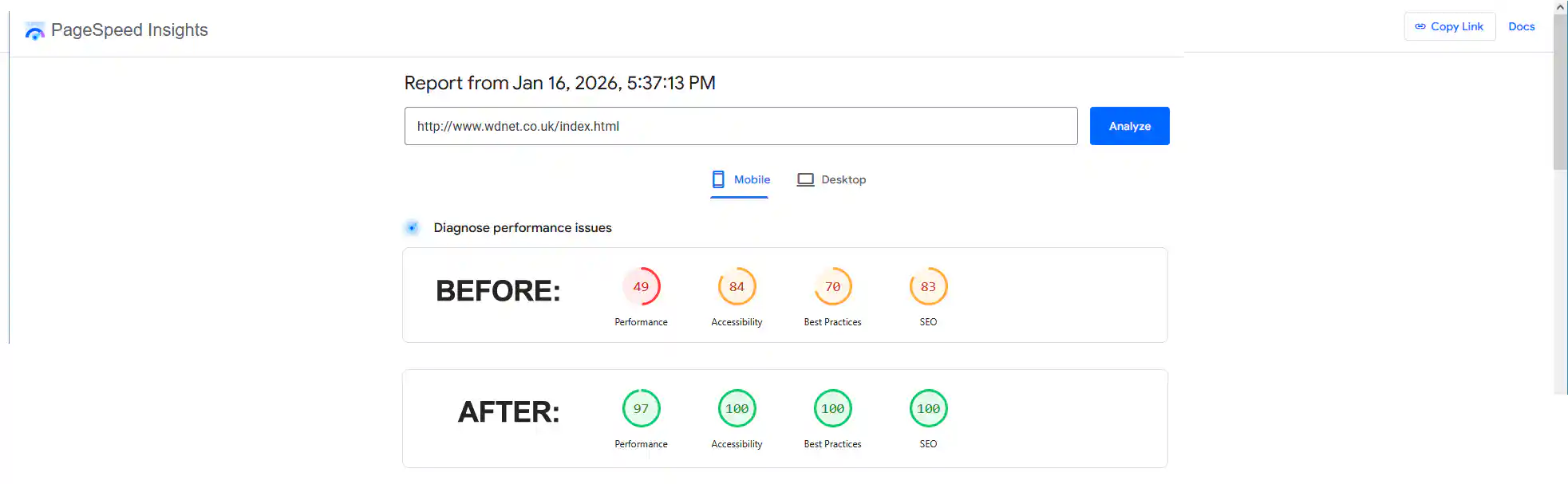
A site with more than 200 pages benefited from specialist server work and a custom routine that removed unused HTML, CSS and JavaScript.

Even modest hosting can produce a fast, stable site when the page is built carefully and unnecessary weight is kept under control.

I am Roy, and I will normally be your first—and continuing—point of contact.
I handle the coding, much of the programming and most of the graphics. For projects that need deeper server or back-end work, I collaborate with Ed, an engineer and programmer whose judgement I trust. My son Paul, a Microsoft-certified technician, also helps when a project needs his particular skills.
I am also part of an informal group of experienced IT professionals—including database, software and graphics specialists—who help one another solve unusual problems. You still deal with me directly; the wider knowledge is there when it is useful.
I began building websites in 1996, when designers often had to handle graphics, code, databases and technical troubleshooting themselves. Browser testing mainly meant Netscape Navigator and Internet Explorer. Google Chrome would not appear until twelve years later.
The web is far more varied now. Rather than trying to guess every browser combination, I write standards-based code, test across modern devices and validate the underlying HTML. That improves consistency, accessibility, maintainability and the chances that a site will continue to behave well as browsers change.





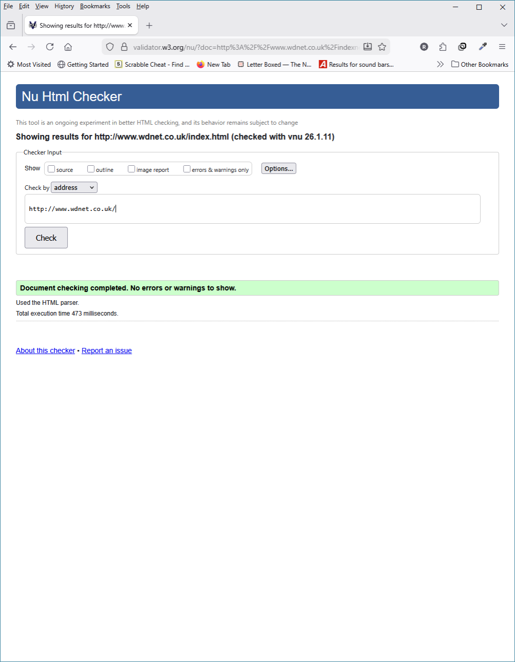
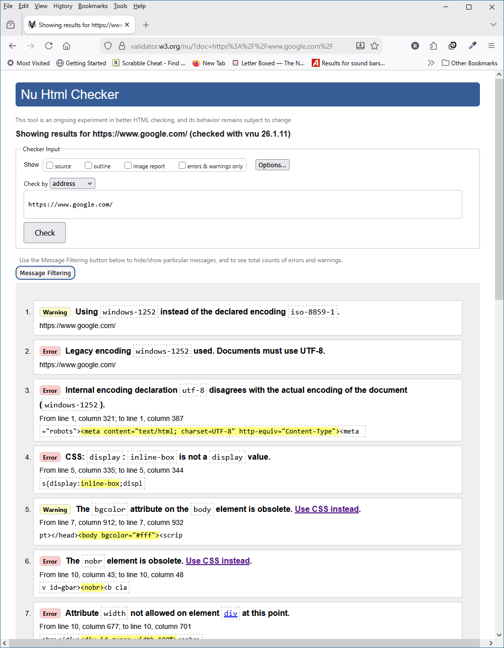
Validating our HTML helps to ensure that a website works consistently across browsers, improves accessibility, supports search engines in understanding the content, and makes future maintenance and debugging easier. It is not a substitute for real-world testing, but it is an excellent quality check that catches errors and gives browsers a more reliable structure to interpret.
Every project is different, so the final price depends on the amount of content, design work and specialist functionality involved. Working from home keeps overheads low, and I explain the likely cost before work begins.
From £45
For a compact brochure-style site when the text and images are supplied and the requirements are straightforward.
From £150
A simple multi-page or more detailed one-page site with room to explain services, establish trust and generate enquiries.
Quoted individually
For custom programming, integrations, server work, larger content sets or features that need research and testing.
No surprise agency overheads. We agree what is being built and what is included. For smaller projects, payment is requested once the agreed work is complete and you are happy with the result.
You do not need a finished specification. A rough idea of what you want to achieve is enough to begin.
Include the type of site, the amount of content you expect, any special features and the timescale you have in mind. I will reply personally and let you know what the sensible next step would be.